The Psychology of Colour in Web Design: How to Choose the Right Palette

The Psychology of Color in Web Design

Colour is one of the most powerful tools in a web designer’s toolkit. The colours you choose for your website design can have a profound psychological impact on your site visitors. Understanding colour theory and psychology is critical to creating a practical and visually appealing website.

In this comprehensive guide, we’ll explore how colour influences emotions and behaviours, cultural considerations for colour selection, creating cohesive brand colour palettes, optimizing website usability through strategic colour use, maximizing call-to-action button effectiveness, ensuring colour accessibility, and leveraging colour to boost conversions. Follow along for actionable tips to help you develop a winning colour strategy for your next web project.

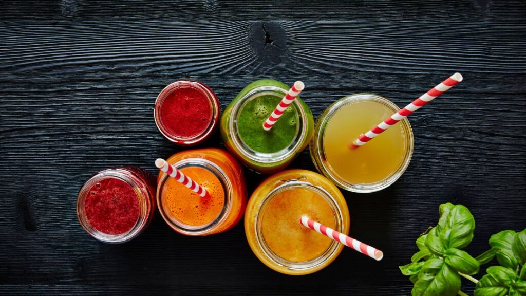
The Basics of Colour Psychology

Before diving into the application, let’s look at some core principles of colour psychology. This field examines how colour affects human perception, decision-making, and actions. It’s essentially the study of hues as a non-verbal communication tool.

The Basics of Color Psychology

While reactions to colour are subjective, general patterns exist. Warm colours like red, orange, and yellow evoke happiness, optimism, and energy. Cool colours like blue, green, and purple are associated with calmness, sadness, or indifference

Specific colours also elicit common psychological responses:

  • Red: Energy, passion, lust, excitement, speed, strength, danger 
  • Orange: Fun, enthusiasm, creativity, vibrancy, balance 
  • Yellow: Joy, intellect, novelty, optimism, clarity 
  • Green: Growth, renewal, health, environment, wealth, inexperience 
  • Blue: Stability, professionalism, logic, calm, trust, melancholy 
  • Purple: Luxury, ambition, creativity, mysticism, wisdom, royalty 
  • Black: Sophistication, mystery, strength, authority, elegance 
  • White: Purity, simplicity, cleanliness, peace, innocence 

However, colour meaning isn’t inherent to the hue itself—context, cultural associations, brightness, adjacent colours, and more impact a colour’s effect. Successful web colour schemes require careful consideration of multiple factors, not just choosing one “right” colour.

Colour Associations in Different Cultures

Culture and geography significantly influence colour symbolism and meaning. Consider these examples:

  • White: Weddings and purity in Western cultures, death and mourning in many Asian cultures 
  • Red: Danger or wrong in Western cultures, happiness and prosperity in China 
  • Green: Nature in many cultures, the sacred colour associated with Islam in North Africa and the Middle East 

Australia’s Aboriginal flag provides localized cultural colour symbolism:

  • Black: Represents the Aboriginal people 
  • Red: Represents the earth, outback, and spiritual relation to the land 
  • Yellow: Represents the sun, the giver of life 

Indigenous artists have embraced an expanded colour palette through exchange with other cultures, especially since colonization. But traditional natural pigments and their symbolic meanings remain culturally important.

Ultimately, no universal colour vocabulary exists across cultures. Effective web design requires researching your target users’ cultural context to choose appropriately meaningful colours.

Choosing the Right Color Scheme for Your Brand

Choosing the Right Colour Scheme for Your Brand

Your brand’s colour palette should strategically align with your brand identity, values, and messaging. Follow this process when selecting brand colours:

1. Define Your Brand Personality and Goals

Conduct brand strategy workshops or exercises to identify your brand personality traits, values, emotions you want to evoke, and brand objectives. This clarifies the meanings you want your colours to convey.

2. Create a Brand Vision Board

Next, create a visual mood board collaging images, fonts, and other visuals representing your brand identity. This helps ideate potential colour directions. Use graphic tools like Adobe Photoshop or apps like Coolors.

3. Select Your Colour Palette

Choose 1-2 primary brand colours and secondary shades or tints. Ensure colours align with your brand personality and goals. For example, blue conveys trust and dependability, suiting many corporate brands

4. Apply Colours Consistently

Roll out your colour palette across all brand touchpoints, including your logo, website, signage, packaging, and promotions. Consistent use reinforces recognition and brand recall.

Select Your Color Palette

5. Test and Iterate

Evaluate colour performance through surveys and testing. Adjust colours over time per audience feedback and to stay on-trend

Invest time upfront in your brand colour selection, which will pay dividends through bold brand recognition and alignment.

Colour and User Experience (UX)

Colour choices significantly impact website user experience (UX). Proper use of colour establishes visual hierarchy, directs user flows, and enhances content scannability and readability.

Guiding the User Journey

Strategic colour use guides visitors through a logical journey on your site. Bright accent colours can direct attention toward calls to action. Cooler hues work well for backgrounds.

Consistent colour patterns can also train users. For example, always use red for error messages or green for success notifications.

Improving Scannability and Readability

Sufficient colour contrast between text and background is essential for scannability and readability. The W3C Web Content Accessibility Guidelines (WCAG) recommend:

  • At least a 4.5:1 contrast ratio for standard text
  • A 3:1 contrast ratio for larger text
  • At least a 3:1 contrast ratio for user interface components, like form fields 
Colour and User Experience

Tools like WebAIM’s Colour Contrast Checker help choose compliant colours. Proper contrast benefits all users, not just those with visual impairments. Prioritize high-contrast colour combinations like dark text on a light background. Avoid low-contrast choices like red on green or blue on purple.

The strategic use of colour truly shapes the overall user experience and journey on your site. Correctly leveraged, it guides users efficiently toward key actions and engages them with visually compelling content.

Colour in Call-to-Action (CTA) Buttons

Call-to-action (CTA) buttons urge site visitors to take desired actions like signing up, subscribing, or purchasing. The right CTA colours can significantly increase conversions. However, no universally best CTA colour exists. Effectiveness depends on audience, industry, and overall design.

Contrast and Visibility

To maximize visibility, CTAs should contrast strongly against their background. For example, a bright blue CTA pops on a muted beige homepage. Avoid blending your CTA into the environment.

While colour alone doesn’t drive conversions, high contrast makes CTAs more eye-catching and click-worthy. Test shades like bright reds, oranges, greens, and blues as starting points.

Consistency Is Key

Keep CTAs consistent across webpages, emails, and ads. Recognition from seeing the same CTA colour repeatedly strengthens the response.

For example, Google uses blue CTAs in all advertising to leverage brand recognition. Breaking consistency dilutes effectiveness as users will not connect coloured buttons with clear meaning.

Conversions Through Testing

Rigorously test CTA colour performance using A/B or multivariate testing. This exposes how colour affects your audience’s behaviours. You may uncover surprising results that overturn assumptions.

Iteratively test shades, saturation, and colour combinations until you find the option that delivers peak conversions. Refine and optimize further through ongoing testing.

Contrast and Visibility

The Role of Colour in Website Accessibility

Designing accessible websites usable by those with visual impairments or other disabilities is an ethical obligation and a legal requirement. Colour choices significantly impact accessibility.

Conveying Information Visually

Relying solely on colour to convey meaning creates barriers for those unable to perceive colour differences. Instead, support colour with text, icons, patterns, and other visual indicators.

For example, an error alert should display red text and include the word “Error”. Do not only highlight the text in red.

Colour Contrast Compliance

Sufficient colour contrast allows those with vision deficiencies to read and interact with websites comfortably. To meet accessibility standards:

  • Minimum 3:1 contrast ratio for standard text 
  • Minimum 4.5:1 contrast ratio for large text 

Testing tools like WebAIM’s Colour Contrast Checker analyze colour pairs. Stick with high-contrast combinations like dark text on light backgrounds.

Designing for Visual Environment

Consider real-world use contexts. A colour scheme passing WCAG standards on a bright monitor may still struggle in low-light situations. Test your site in different environments.

Prioritize high contrast, avoid relying solely on colour cues, and thoroughly test your designs to ensure broad accessibility.

Using Colour to Enhance Website Conversion Rates

Strategic use of colour boosts website conversions by capturing user attention, directing flows, and influencing psychology.

Action-Driving Case Studies

Consider these examples of improved conversions through colour optimization:

  • Moz: Changed call-to-action button from green to yellow, lifting conversion rates 187.4% 
  • Performable: Tested green vs red homepage CTA buttons. Red drove 21% more clicks
  • L’Axelle: Emphasized the “Add to Cart” button using a high-contrast colour, increasing conversions. 
Using Colour to Enhance Website Conversion Rates

Leveraging Colour Psychology

Specific colours elicit emotional responses that can drive desired user actions. For example:

  • Trust and security: Use conservative blues and greens to convey safety for financial sites
  • Passion and excitement: Warm reds and oranges signal vibrant energy for youth brands
  • Cheerfulness and optimism: Yellows and bright greens promote positivity

Apply principles of colour psychology to guide users through emotive journeys tailored to your brand.

Testing for Maximum Conversions

Regularly, A/B tests alternate colour schemes and individual elements like CTAs or buttons. Analyze performance data to optimize colours to maximize conversions continuously.

Fine-tuned use of colour aligns with your brand identity while eliciting the desired psychological responses from your audience. Follow proven conversion techniques, but set your colour strategy through iterative testing.

Tools and Resources for Selecting Web Design Colours

Many helpful online applications exist to generate, test, and manage colour palettes:

  • Adobe Color CC: Colour wheel creation tool plus premade schemes.
  • Coolors: Simple colour palette generator with excellent gallery.
  • Palleton: Generates colour schemes based on relationships.
  • HueSnap: Creates, saves, and shares colour palettes.
  • Colour Explorer: Advanced features for creating and converting palettes.
  • Colorable: Tests colour combinations for accessibility.
  • Check My Colours: Checks colour contrast compliance.
  • Color Hunter: Automatically generates palettes from images.

These sites help designers cleanly arrange colours, preview potential schemes and test combinations for accessibility and visual effectiveness.

Tools and Resources for Selecting Web Design Colours

Conclusion

Colour choices are more than just cosmetic. They influence emotions and behaviours, convey cultural meanings, strengthen brand recognition, guide site navigation, focus user attention, and prompt conversions.

Leverage the psychology of colour paired with audience and industry awareness to maximize the impact of your next web project. Use the processes and tools we’ve covered to strategically craft an engaging, brand-aligned, and conversion-focused colour scheme.

Colour wields immense influence. Mastering colour psychology and strategy elevate websites beyond the expected, creating memorable experiences and compelling brands.

For help developing a custom, conversion-driven colour strategy for your website, contact Robert at Meta Trends. Our team brings decades of data-backed industry expertise to provide personalized colour consulting for your brand and business goals.

Designing for Mobile: Essential Tips for Creating a Mobile-Friendly Website

Mobile First Web Design

Hey there! Robert here from Meta Trends, your friendly neighborhood web developer. As more and more people access the internet primarily through mobile devices, having a website optimized for smaller screens is no longer optional – it’s essential for providing a great user experience.

In this comprehensive guide, I’ll walk you through the critical elements of designing an effective and user-friendly mobile website. Whether starting from scratch or looking to improve an existing site, you’ll discover mobile-friendly design strategies that can help you engage and convert mobile visitors. Let’s dive in!

Introduction: The Growing Mobile Landscape

The mobile revolution is well and truly underway. Today, over 50% of web traffic comes from smartphones and tablets, which is only expected to grow over the next few years. Here are some fascinating statistics that highlight the steady rise of mobile:

  • Global mobile internet usage has more than doubled from 2016 to 2023, from 44% to over 96%.
  • More than 90% of users keep their smartphones within arm’s reach 24/7.
  • 7 of 10 smartphone owners check their devices within 15 minutes of waking up.
  • 52% of website traffic is from mobile devices, versus 48% from desktop.

With mobile dominating the digital landscape, having a mobile-friendly website is now necessary rather than a nice addition. A website failing to provide an excellent mobile experience risks losing a significant chunk of its audience and potential conversions.

Throughout this guide, we’ll explore practical tips and strategies to help you create a fast, user-friendly mobile website that caters seamlessly to touchscreen users on the go.

Section 1: Understanding Mobile User Behavior

To design an optimal mobile experience, it’s essential to understand how mobile users behave differently than desktop users. Mobile visitors tend to have shorter attention spans, browse websites differently, and have different expectations.

Understanding Mobile User Behavior

Critical Differences in Mobile Browsing Habits

Several studies have uncovered noteworthy differences between mobile and desktop browsing habits:

  • Mobile use peaks at different times: Mobile usage tends to spike during morning and evening commute hours as users browse. Desktop usage is more prominent during regular business hours.
  • Mobile browsing is more fleeting: The average mobile visit lasts less than 3 minutes versus over 5 minutes on a desktop. Mobile users are more likely to bounce between sites and apps quickly.
  • Mobile users are more distracted: It’s easier for them to get interrupted or multitask, so maintaining their attention requires a concise delivery of information.
  • Content consumption varies: Mobile users often consume lighter content quickly, like social media updates or news briefs. Desktop users tend to read more in-depth articles and research.

Mobile users tend to have shorter, more distracted browsing sessions than desktop users. This has important implications for your website design and content strategy.

Catering to Shorter Mobile Attention Spans

Studies show the average human attention span has shortened from 12 seconds in 2000 to 8 seconds today [8]. This effect is amplified on mobile devices, where small screens and constant notifications make it easier for users to lose focus.

Here are some tips to accommodate mobile attention spans:

  • Prioritize above-the-fold content: Position your most important information at the top so mobile users see it immediately without having to scroll down.
  • Use shorter paragraphs: Break content into manageable chunks using bullet points, numbered lists, headings, and paragraphs with no more than 2-3 lines.
  • Highlight key points: Use bold, italics, or text color to emphasize important points and make scanning quicker.
  • Add visual interest: Insert relevant images, illustrations, data visualizations, videos, or GIFs to capture attention before the text.
  • Simplify navigation: Limit main navigation links to 5-7 options and have a minimalist mobile menu to avoid overloading users.
Meeting Mobile User Expectations

Meeting Mobile User Expectations

Today’s mobile users expect websites to be designed specifically to their needs and constraints. Some common expectations include:

  • Fast load times: 40% of mobile users abandon a page that takes over 3 seconds to load. Optimizing site speed is critical.
  • Easy navigation: All core site functions should be accessible within 1-2 taps. Minimal scrolling should be required.
  • Mobile-first design: The site layout, touch targets, and text size should cater to mobile screens first rather than just shrinking the desktop site.
  • Personalization: Location data and personalization features like past browsing history are more readily shared on mobile and expected to customize content.
  • Task-based efficiency: Mobile users expect to be able to quickly accomplish specific tasks, like checking a product price or finding store hours.

Keeping these expectations and behaviors in mind will allow you to craft website experiences explicitly tailored to mobile user needs.

Section 2: Responsive Design Principles

Responsive web design (RWD) is an approach that allows your website content to adapt to different screen sizes, from desktop to mobile, flexibly. Making your site “responsive” is crucial for delivering a consistent, seamless experience across devices.

Responsive design rests on three core web development principles:

  1. Fluid grid layouts
  2. Flexible images and media
  3. Media queries

Let’s look at how to implement each principle:

Building a Fluid Grid Layout

Responsive sites are built on flexible grid systems rather than fixed pixel widths. As the viewport scales up or down, elements within the grid fluidly resize themselves to fit the available space.

Constructing a fluid grid starts with defining column widths using percentages rather than pixels. Here’s a simple responsive layout with two columns:

.column-1 {
  width: 70%;
  float: left; 
}

.column-2 {
  width: 30%;
  float: left; 
}

This allows the columns to dynamically adjust their widths relative to the viewport rather than adhering to static pixel dimensions.

Building a Fluid Grid Layout

You can refine this using a mobile-first approach by stacking the columns vertically for mobile before re-arranging them horizontally for desktop breakpoints.

For advanced responsive layouts, leverage a CSS framework like Bootstrap that handles the intricate styles and scripts.

Making Images and Media Flexible

For images and other media assets, you’ll want to make them flexible to prevent distortion across screen sizes.

A simple way is by adding this CSS:

img {
  max-width: 100%;
  height: auto;
}

This allows the image to scale down when needed but not stretch larger than its native size.

For even greater control, the <picture> element lets you define different image files to load based on media queries. For example:

<picture>
  <source media="(max-width: 600px)" srcset="small-image.jpg">
  <source media="(min-width: 600px)" srcset="large-image.jpg">
  <img src="default-image.jpg"> 
</picture>

This displays small-image.jpg for mobile and large-image.jpg for desktop, providing the best-optimized asset for each.

Using Media Queries to Adapt to Screens

Media queries allow you to conditionally apply blocks of CSS styling based on criteria like viewport width or device orientation. This is how responsive designs can tweak the layout to best suit the user’s screen size.

For example, you may define a mobile-specific navigation menu like so:

@media screen and (max-width: 576px) {

  .mobile-menu {
    /* Styles for mobile menu */
  }

}

This displays the alternative .mobile-menu only on small screens, seamlessly adapting the experience.

You can set multiple breakpoints to fine-tune the responsive behavior. Aim to keep your navigation usable at widths as narrow as 320px to accommodate all devices.

For a primer on media queries, check out this video.

Mastering these three responsive design principles allows you to construct an interface that caters to any screen size, providing a polished mobile experience.

Section 3: Simplifying Navigation for Mobile

An intuitive navigation menu is one of the most important elements to optimize for mobile. You want to simplify and declutter the desktop navigation to highlight only the essentials in an easy-to-use mobile layout.

Simplifying Navigation for Mobile

Here are eight tips for mobile navigation success:

1. Streamline your menu options

Cut down your main navigation links to only what’s necessary on mobile. These should focus on primary pages and tasks, such as:

  • Homepage
  • Product/service pages
  • Contact page
  • Account/profile

Ideally, limit it to 5-7 top-level options. Additional secondary links can go in a mobile side menu.

2. Use succinct, clear labels

Navigation-link labels should be short and focused and use keywords that convey where they lead. For example, “Shop” instead of “Products”.

3. Make buttons fingertip-friendly

Links and buttons should be large enough for easy tapping, at least 44px x 44px. Include ample spacing between elements as well.

4. Test on touch devices

Continuously test your navigation on actual mobile devices to ensure responsiveness and usability. Your finger won’t lie!

5. Place prominent calls to action

Consider important calls to action (like Contact or Get a Quote) through visual contrast, prominent positioning, or notifications.

6. Have a mobile fallback menu

Use a “hamburger” menu icon to hide secondary links under a dropdown tap for minimalist mobile layouts.

7. Use responsive code

Build your menu using media queries and percentages rather than fixed pixels to flow across device sizes.

8. Avoid clutter

Keep your mobile navigation clean and scannable. Too many elements cause clutter and inhibit scanning.

By honing your navigation design, you can create mobile menus that are effortless to use and optimized for speedy decision-making.

Optimizing Content for Mobile Screens

Section 4: Optimizing Content for Mobile Screens

With less screen real estate available, content must be adapted for optimum mobile readability. Applying these strategies will help mobile visitors easily digest your content:

Lead with the main point

Get to the core info first before elaborating. Mobile readers will appreciate you highlighting the most important content upfront.

Use succinct paragraphs and lists

Avoid dense walls of text. Break content into short 1-3 sentence paragraphs using bullet points or numbered lists where appropriate. Lists help focus attention on key ideas.

Structure content with headings

Add descriptive subheadings (H2, H3 tags) to content sections. Headings create visual structure and make skimming easier.

Include visuals

Insert relevant images, illustrations, charts, or videos where appropriate. Visuals quickly engage readers and enhance scannability. Ensure they are optimized for small screens.

For more lengthy articles, you can provide “Read More” links after short previews to unclutter the mobile layout while allowing access to further content.

Use responsive text sizing

Make sure text can resize responsively across devices for improved readability. Avoid absolute pixel or em sizes.

Maintain simplicity

Streamline content to focus on key tasks and messages. Remove any non-essential content that clutters the mobile interface.

Creating bite-sized, scannable content optimized for mobile makes it easy for on-the-go users to extract value from your pages quickly.

Section 5: Optimizing for Speed

Site speed is a make-or-break factor for mobile usability. With slower networks and impatience for laggy sites, optimizing for faster page loads is critical.

Optimizing for Speed

Here are five performance tips to accelerate your mobile website speed:

1. Minify code

Minification removes unnecessary characters from code like whitespace, comments, and indentation to reduce file size. This significantly speeds up load times. Enable minification in your Content Management System or use tools like Grunt.

2. Compress images

Image optimization compresses file sizes without sacrificing quality. Use compressed JPG, PNG, and WebP formats. Consider lazy loading images below the fold.

3. Use a CDN

Content Delivery Networks (CDNs) distribute static assets globally so visitors download from nearby servers, reducing latency. CDN services like Cloudflare also cache assets.

4. Enable browser caching

Browser caching allows assets to be temporarily stored locally on a device, avoiding re-downloads with each page visit. Configure server headers for optimal caching.

5. Eliminate redirects

Multiple unnecessary redirects can slow things down. Audit your site for chains of redirects and create direct links where possible.

With page load times directly impacting your mobile visitors’ experience and satisfaction, dedicating effort towards performance optimization is one of the highest-value activities.

Section 6: Designing Intuitive Mobile Interactions

Catering to smaller touchscreens requires some unique design considerations to create easily tappable interactive elements:

Fingertip-friendly sizes

  • Buttons/links: ~44px x 44px minimum
  • Input fields: height ~36px minimum
  • Provide ample spacing between elements (at least 8px)
Designing Intuitive Mobile Interactions

Clear visual cues

  • Use color contrast, shadows, and animations to indicate tappability
  • Display keyboard cues (e.g., input placeholder text)

Limit typing input

  • Use dropdowns/selections instead of typing where possible
  • Minimize free-form fields

Test touch targets

  • Tap around on real devices to find any usability issues
  • See if interface elements are comfortably reachable

Support “thumb zones”

  • Place necessary actions centrally where thumbs easily reach
  • Avoid critical actions only in far corners

Ensure touchscreen compatibility

  • Use apps like Typewise to test tap target sizes
  • Confirm all interactive elements respond to touch events

Though often overlooked, crafting your site for seamless touch interactions can enhance usability and accessibility for your mobile visitors.

Section 7: Testing Across Devices

To build a polished mobile experience, continuously testing your site across physical devices is essential. Relying solely on resizing a desktop browser misses many mobile-specific issues.

Testing Across Devices

Here are some tips to incorporate hands-on testing in your process:

Use real mobile devices

Invest in having a variety of smartphones and tablets for testing. This allows you to experience the UI and speeds firsthand.

Test on iOS and Android

Evaluate functionality on both platforms. One may exhibit platform-specific bugs, and the other doesn’t.

Try different networks

Verify performance on WiFi, 3G, and even 2G networks. Speed bottlenecks become apparent on slower connections.

Test orientations

Rotate devices to portrait and landscape modes to detect any layout issues.

Do field testing

Test your site on the go: in cars, outdoors, or where users will access your site. Real-world conditions often uncover unique usability problems.

Gather user feedback

Have target users evaluate your mobile experience and provide qualitative feedback through interviews or surveys.

Regular hands-on mobile testing throughout development can help you identify and rapidly iterate on issues before launch.

Section 8: Ensuring Mobile Accessibility

An accessible mobile experience is usable by all people regardless of disability. Failing to account for accessibility needs excludes segments of your audience.

Here are 5 tips to help make your mobile site inclusive:

Design for screen readers

Screen reader users should be able to navigate and understand content without visuals logically. Ensure proper semantic HTML structure.

Provide text alternatives

Images, icons, and multimedia require accompanying text descriptions to convey their meaning for screen reader users.

Ensure color contrast

Visual elements must have sufficient color contrast to remain distinguishable for low-vision users.

Make tap targets spaced and sized

Tap target spacing and sizing should accommodate users with motor impairments. Minimum sizes help avoid mis-taps.

Ensuring Mobile Accessibility

Support OS accessibility features

Ensure your mobile site integrates with native accessibility tools like screen readers or text resizing built into iOS and Android.

Visit WebAim for a comprehensive mobile accessibility checklist and best practices.

While meeting every criterion takes effort, improving the accessibility of your mobile experience opens it up to millions more potential users – and it’s the right thing to do.

Section 9: Optimizing for Mobile SEO

Designing a mobile-friendly site doesn’t just improve user experience – it’s also better for search engine optimization (SEO).

With Google’s mobile-first indexing making mobile version SEO a priority, here are five ways to boost mobile SEO:

1. Ensure site is mobile-friendly

Google specifically boosts mobile-friendly pages in search rankings. Eliminate mobile site errors and confirm your site meets Google’s mobile-friendliness criteria.

2. Optimize speed

Faster mobile sites are rewarded with better SEO since slow load times increase bounce rates. Minify code, compress images and optimize caching.

3. Use structured data

Adding structured data like FAQ schema or product schema can enhance the presentation of your pages in mobile search results.

4. Target long-tail keywords

Longer, conversational keywords are used more on voice searches. Optimizing for natural language queries can capture voice traffic.

5. Provide local information

Enable Google My Business and include accurate location or contact info to appear for relevant local searches by mobile users.

With mobile-first indexing, ensuring your site provides an excellent mobile experience is crucial for solid SEO performance.

Conclusion

Hopefully, this guide has provided a helpful overview of techniques and strategies to consider when designing your website for mobile visitors.

While optimizing for mobile does require dedicating effort up front, doing so pays dividends through better user experience, engagement, conversions, and search visibility.

As mobile continues to dominate traffic, ensuring your website caters to touch devices will only grow increasingly important over time. By following an iterative, user-centered design process, you can craft interfaces that feel purpose

How to Disable Comments in WordPress

Disable Comments in WordPress

Comments can be a great way to build community and engagement on a WordPress website. However, managing and moderating comments can be time-consuming, and excessive or irrelevant comments can detract from your content. In some cases, disabling comments entirely may be the best approach. Here’s a comprehensive guide on how to disable comments in WordPress.

What are Comments in WordPress?

The comments feature allows visitors to your WordPress site to comment on your posts and pages. This enables discussions and conversations centred around your content.

When a user leaves a comment, it enters a moderation queue for review before appearing publicly on your site. You can approve, edit, delete, or report comments as the site owner.

The comment section is vital to building community, developing relationships with readers, and getting feedback on your content. However, not all websites need or benefit from comments.

What are Comments in WordPress?

Why You Might Want to Disable Comments

There are a few common reasons you may want to turn off comments on your WordPress site:

  • Reduce spam: The comment section can attract a lot of spam despite available protections. Disabling comments helps keep spam under control.
  • Improve security: Spam comments can be used for phishing scams, malware injection, and other security threats. Disabling comments enhance security.
  • Save time: Checking, moderating, and replying to comments is hugely time-consuming. Eliminating them frees up time for content creation.
  • Avoid harassment: Comments can sometimes become a forum for harassment and abuse. Disabling them removes this liability.
  • Stay focused: Excessive comments can distract from your core content. Disabling them keeps the focus on your posts and pages.

The decision depends on your goals, audience, and capacity to manage discussions. For some sites, the benefits outweigh the drawbacks.

How to Globally Disable Comments in WordPress

If you wish to turn off comments across your entire WordPress site, you have a couple of options:

Using WordPress Settings

  1. Log in to your WordPress dashboard.
  2. Go to Settings > Discussion.
  3. Uncheck the box next to “Allow people to post comments on new articles”.
  4. Click Save Changes.

This will turn off comments on all posts and pages. Existing comments will remain visible.

How to Globally Disable Comments in WordPress

Using a Plugin

Plugins like Disable Comments offer more options for globally disabling comments.

  1. Install and activate the Disable Comments plugin.
  2. Go to Settings > Disable Comments.
  3. Check the “Everywhere” option to disable comments everywhere.
  4. Click Save Changes.

Plugins add flexibility, like disabling certain comment types or preserving existing comments when disabled.

How to Selectively Disable Comments

Sometimes, you may wish to turn off comments only on specific posts, pages, or categories rather than site-wide. Here are a couple of ways to do so:

From the Editor

On individual posts or pages:

  1. Edit the post or page where you want to disable comments.
  2. Locate the “Discussion” box. Check “Screen Options” to add it if needed.
  3. Uncheck “Allow Comments”.
  4. Update the post or page.

Comments will now be disabled on only that piece of content.

From Settings

To turn off comments for specific post types, taxonomies, or content:

  1. Go to Settings > Discussion.
  2. Scroll down to “Other comment settings”.
  3. Under advanced settings, choose “Add an exception” and select the post types, categories, tags, etc., you want to disable comments.
  4. Save your changes.

This allows you to selectively turn off comments on certain content without affecting the rest of your site.

How to Remove the Comment Section from Your Theme

If you want the comments section removed entirely rather than just disabled, you will need to edit your theme files. There are a few ways to do this:

How to Remove the Comment Section from Your Theme

With Custom CSS

  1. Go to Appearance > Customize > Additional CSS.
  2. Add the following snippet:
.comments-area {
  display: none; 
}
  1. Publish changes.

This will hide the comment section but not remove it from the code.

Via Functions.php

  1. Open your theme’s functions.php file, usually in /wp-content/themes/your-theme/.
  2. Add this code:
function remove_comments() {
  remove_action('wp_head', 'feed_links_extra', 3);
  remove_action('wp_head', 'feed_links', 2); 
  remove_action('wp_head', 'rsd_link');
  remove_action('wp_head', 'wlwmanifest_link');
  remove_action('wp_head', 'index_rel_link');
  remove_action('wp_head', 'parent_post_rel_link', 10, 0);
  remove_action('wp_head', 'start_post_rel_link', 10, 0);
  remove_action('wp_head', 'adjacent_posts_rel_link', 10, 0);
  remove_action('wp_head', 'adjacent_posts_rel_link_wp_head', 10, 0);
  remove_action('wp_head', 'wp_generator');
  remove_action('wp_head', 'wp_shortlink_wp_head', 10, 0);

  remove_action('template_redirect', 'wp_shortlink_header', 11, 0);

  remove_action('template_redirect', 'rest_output_link_header', 11, 0);

  remove_action('wp_print_styles', 'print_emoji_styles');

  remove_action('admin_print_scripts', 'print_emoji_detection_script');

  remove_action('wp_print_styles', 'print_emoji_styles');

  remove_action('admin_print_scripts', 'print_emoji_detection_script');

  remove_filter('the_content_feed', 'wp_staticize_emoji');

  remove_filter('comment_text_rss', 'wp_staticize_emoji'); 

  remove_filter('wp_mail', 'wp_staticize_emoji_for_email');

  add_filter('wp_resource_hints', 'disable_emojis_remove_dns_prefetch', 10, 2);
}

function disable_emojis_remove_dns_prefetch($urls, $relation_type) {
  if ('dns-prefetch' === $relation_type) {
      return array_diff( $urls, array('https://s.w.org') );
  }

  return $urls;
}

add_action('init', 'remove_comments');
  1. Save changes and upload the updated file to your server.

This will fully remove all comment-related code from your WordPress front and back end.

How to Disable Comments on Media

By default, WordPress allows comments on attachments and media library items. To disable:

  1. Go to Settings > Discussion.
  2. Uncheck “Allow comments on media files uploaded to posts and pages”.
  3. Save Changes.

Alternatively, comments can be disabled for individual files:

  1. In the media library, open the file you wish to disable comments.
  2. Expand the file details and uncheck “Allow Comments”.
  3. Update the media file.

Like posts and pages, this will turn off comments for that file without affecting others.

The Pros of Disabling Comments

While comments can have benefits, there are advantages to disabling them as well:

  • Increased security – Fewer points of entry for spam, scams and attacks.
  • Spam reduction – Say goodbye to annoying, irrelevant spam messages.
  • Faster moderation – No need to manually approve and manage comments.
  • Improved user experience – Content remains clean and focused without distracting words.
  • More control over discussions – Choose where and how meetings occur, like social media.

Evaluate your needs and goals to determine if your site’s pros outweigh the cons.

The Cons of Disabling Comments

However, it’s also important to consider potential drawbacks:

  • Decreased engagement – Visitors have fewer ways to interact with your content.
  • Loss of feedback – Valuable comments with insights and opinions will be eliminated.
  • Negative SEO impact – Less keyword-rich content from comments.
  • Less social proof – Comments are social proof that content provides value.
  • Fewer leads and sales – Comments can lead to conversions.
  • Less community – There is nowhere for regular visitors to connect and converse.

For some sites, the sense of community and feedback comments are integral. Assess whether removing them will do more harm than good for your goals.

Pros and Cons of Disabling Comments

When to Disable Comments

Rather than taking an all-or-nothing approach, you may choose to disable comments selectively:

Controversial Posts

Some topics tend to attract excessive negativity. Disabling comments on controversial or sensitive posts can create a more positive environment.

Very Old Content

Older, evergreen content may still rank well but have outdated information. Disabling comments helps keep the focus on more recent and relevant posts.

Repurposed Content

If you repurpose content from other sources, disabling comments keeps the discussion focused on the source article.

Evaluate each post to determine whether open comments provide value or not. You can disable it on a case-by-case basis rather than completely.

Alternatives to Disabling Comments

If completely removing comments seems too drastic, consider alternatives like:

  • Using a third-party commenting system – Services like Disqus allow for better moderation and integration.
  • Selectively disabling comments – Turn off commenting for only problematic posts rather than completely.
  • Using comment moderation – Manually or automatically hold comments for review before publication.
  • Requiring login to comment – Reduces spam by requiring an account to comment.
  • Limiting comment date range – Automatically close commenting on posts after a certain number of days.
  • Encouraging social sharing – Allow users to share feedback via social media instead of your site.

Look for middle-ground solutions that balance your goals, community, and site management capabilities.

Conclusion

The comments section can be a double-edged sword. While comments allow for community engagement, they also require heavy moderation, risk security issues, and distraction.

Fortunately, WordPress provides options to fully disable comments site-wide or selectively by post, category, user role, and more. You can also use CSS or code snippets to hide or remove comment sections without losing the content.

Evaluate your audience, goals, and site management capacity. For some sites, the sense of community comments provide outweighs the headaches. For others, comments aren’t worth the risks and maintenance required.

By understanding the options available, you can determine the correct comments strategy for your unique WordPress site. The choice ultimately comes down to which options provide the most benefits with the fewest drawbacks.

This post covered standard techniques for disabling WordPress comments at a global or selective level. To recap, you can disable comments by:

  • Toggling discussion settings in the dashboard
  • Using plugins like Disable Comments
  • Modifying theme files and WordPress hooks
  • Changing settings for individual posts, pages and taxonomies
  • Using custom CSS to hide comment sections
  • Removing related theme code in functions.php

This comprehensive guide gives you all the background and step-by-step instructions needed to control WordPress comments. Now, it’s simply a matter of deciding what strategy works best for your site and goals.